Atari Eastern Front 1941: browser redux
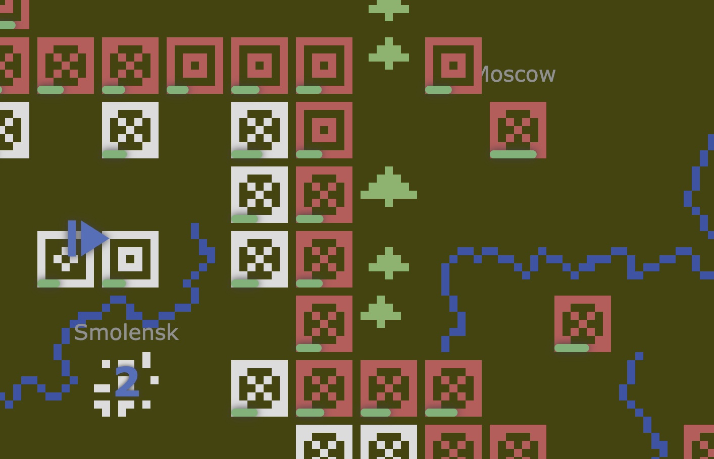
Check out my playable TypeScript port of Chris Crawford’s Eastern Front 1941. Can you capture Moscow? More importantly, how long can you hold it? The project started as a pandemic diversion after chancing on an article about Atari’s 50th anniversary. I tumbled into a memory rabbit hole and discovered that Chris Crawford had published much of his early source code, including t...
G3: a flexible framework for steam gauge instrument panels
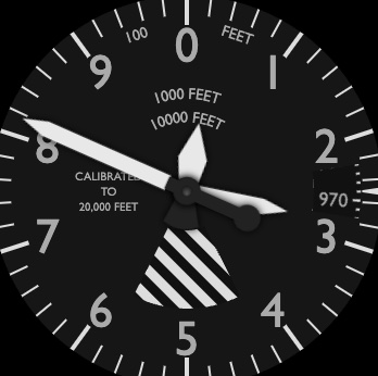
G3 is a flexible Javascript framework for building steam gauge instrument panels that display live external metrics from flight (or other) simulators like X-Plane and Microsoft FS2020. This demo gives a sense of what you can build: G3’s goal is to provide a lightweight, browser-based solution for building steam-gauge control panels using simple hardware atop a commodity LCD...
Taming the flowsnake and visualizing Covid proteins

The Gosper curve is a well-known space-filling curve. It sports a dual form called a flowsnake which sequentially visits every hexagon of an infinite lattice with no jumps or crossovers, reminiscent of the Hilbert curve on the Cartesian (square) grid. Counting along the curve is a little slippery (it is a snake after all!) but we’ll show how counting in negative base 7 with an...
Atari Eastern Front 1941: Chris Crawford's narrative history

Chris Crawford’s original “narrative history” of his work on Eastern Front 1941 is a great read from a general software engineering and product management perspective. The AI player implementation in 1200 bytes of assembler is mind-blowing. That’s what hooked me on porting the game. What follows is OCR’d text from scanned PDFs of Chris Crawford’s original type-written note...
Cartoon maps
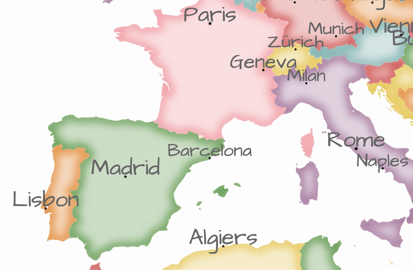
A quick visualization experiment to create an informal / cartoonish map reminiscent of the game of Risk. The watercolor country border style is achieved by drawing a wide stroke around each country in the same color as the semi-transparent fill, then applying Gaussian blur to smudge the border while clipping to the original outline leaving a sharp boundary.
Omega Speedmaster Demo
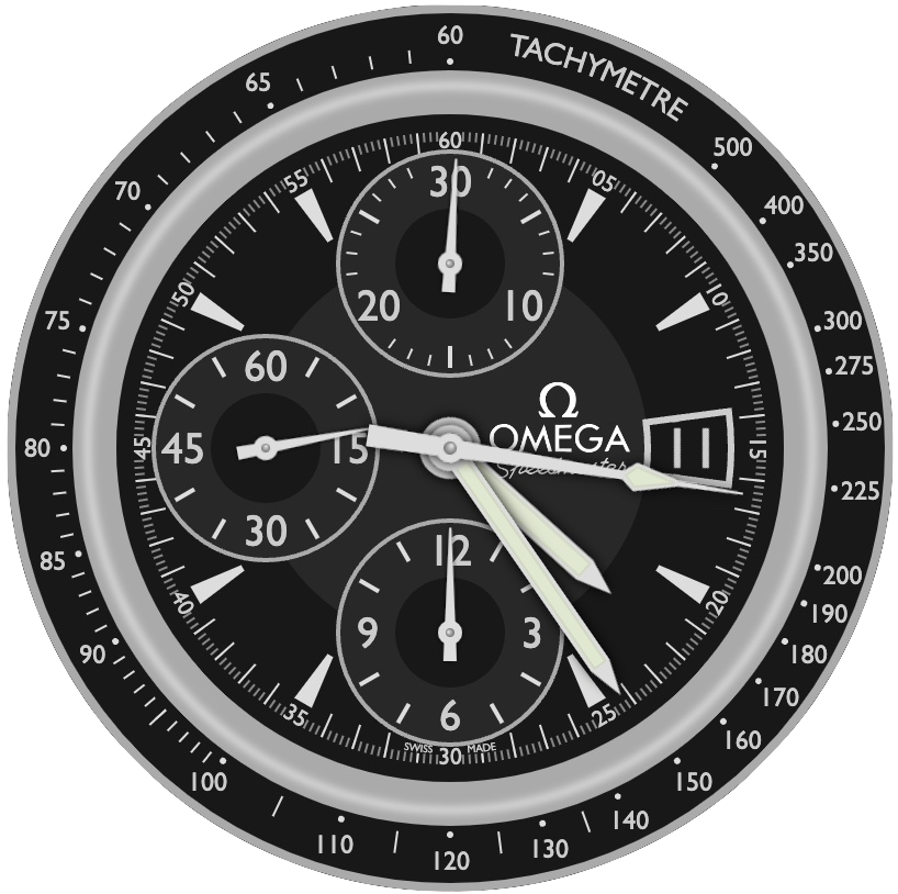
Did I mention I got obsessed with gauges? I reconstructed the iconic Omega Speedmaster watch using my G3 toolkit as an illustration of its flexibility to create complex, working gauges that look good.
Hex cube visualization

This visualization was inspired by Amit Patel’s diagram illustrating cube coordinates. That diagram initially confused me because the edges of the grid cubes centered on integer coordinates in the plane x + y + z = 0 don’t themselves lie in the plane, so it seemed like the animation “cheated” at the end by dissolving to planar hexagons. But of course the point is just that th...
Hopper’s data science DNA: the tenets we live by

At Hopper, we’re busy building the world’s most customer-centric travel marketplace. Traditionally, buying travel has been time-consuming, frustrating and often leaves the customer dissatisfied: feeling that they could have done better if only they’d worked harder. By analyzing huge volumes of market pricing & demand data (trillions of records a month) and building personali...
Geographic heatmap in D3
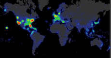
Illustrates how to use Vladimir Agafonkin’s clever simpleheat JS library to overlay a heatmap of Hopper search destinations on a D3 map. Just for fun we use a separate svg layer ‘under’ the canvas to display the map, although it’s easy enough to have D3 render direct to the canvas. The default canvas (and svg) ‘background’ is transparent so we can see through layers, making it ...
Litebrite flight shopping animation
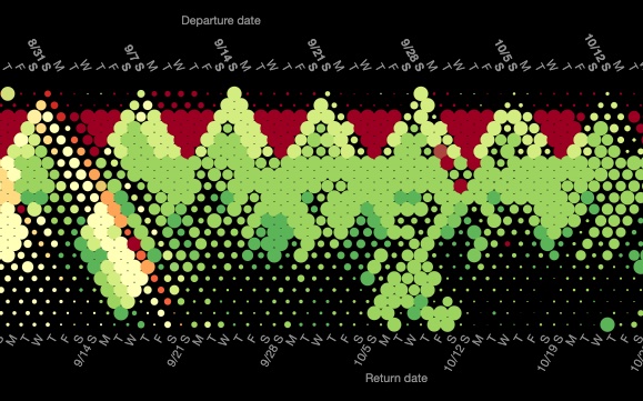
This is a simple D3 animation of flight shopping data for a single route, inspired by LiteBrite. A number of interesting patterns surface, like the downward pointing red triangles corresponding to expensive mid-week trips without a Saturday night stay, and small upward pointing triangles showing quick weekend trips. Travel gets cheaper after summer vacation (early September), bu...